Camel (1991)
Print, Art Direction
It was the last cigarette brand with a big personality. During the early 90’s, Camel was the irreverent underdog to the Marlboro juggernaut – holding only a small percentage of the market, but having the loudest voice out there. The campaign was cheeky, exciting and… controversial.
Baptism by Fire (or Smoke)
I was just out of art school, it was my first job and I dove in head first learning all about the advertising business. The pieces we produced were fun and over-the-top. I never felt like we were marketing to an underage market – it felt like we were talking to other twentysomethings. After all, that was makeup of the core team producing it.
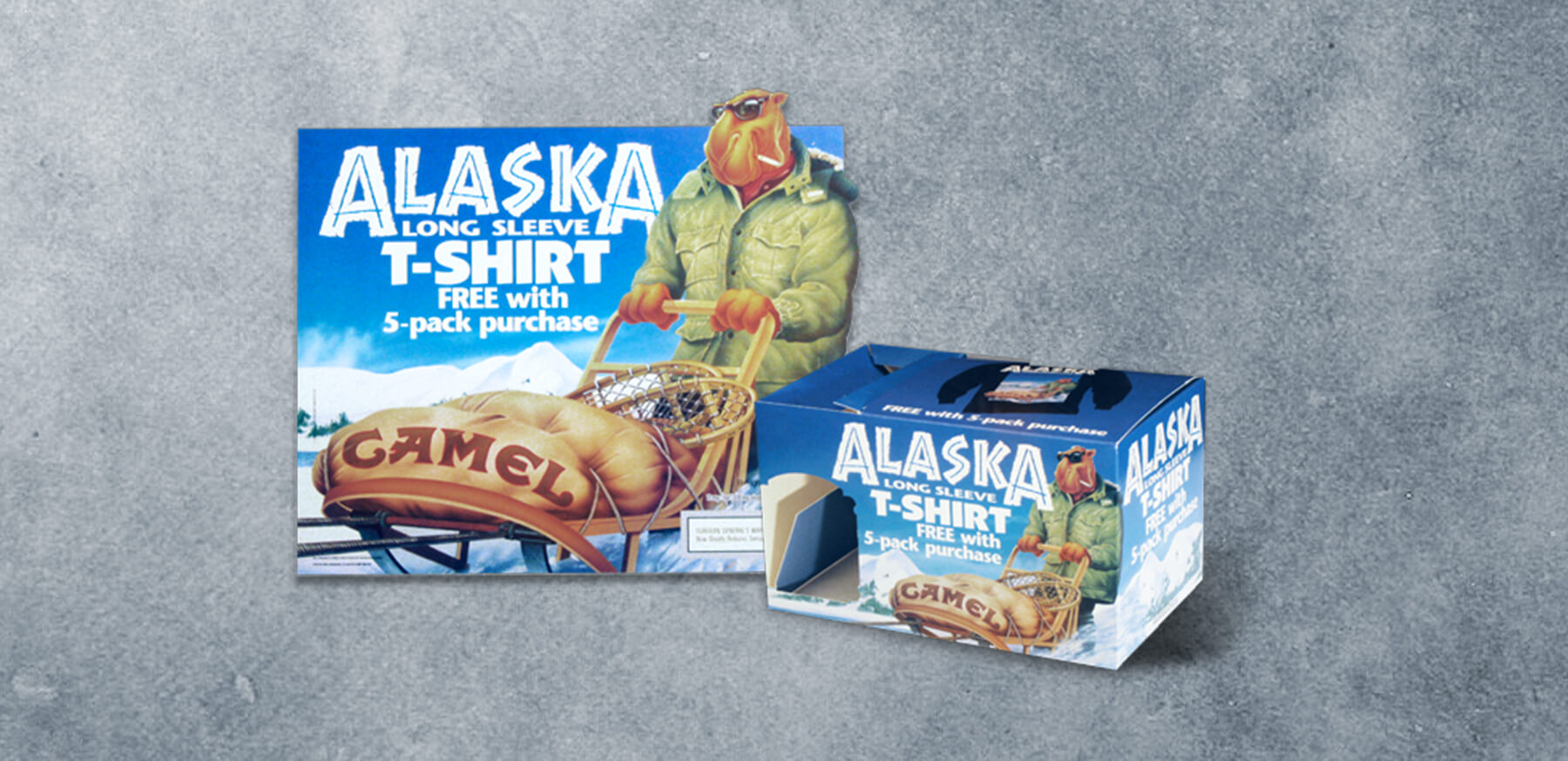
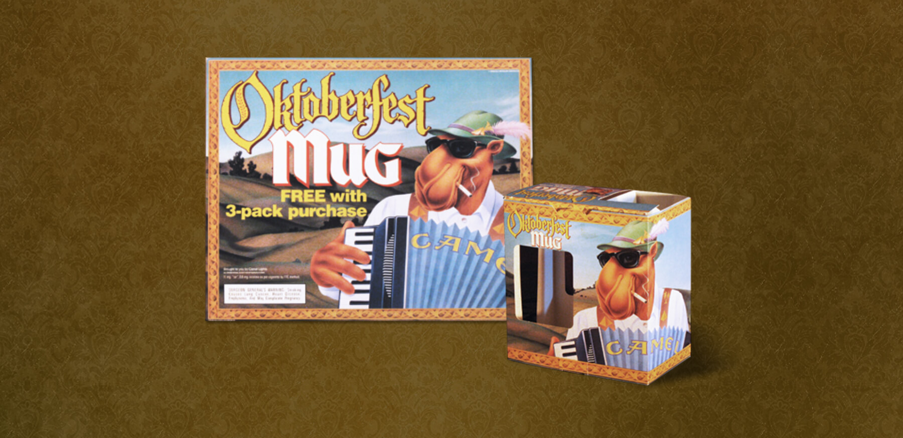
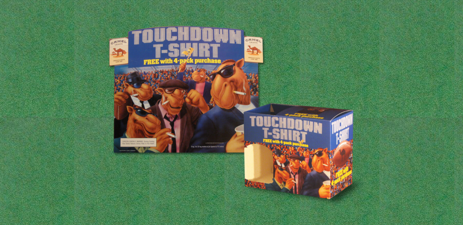
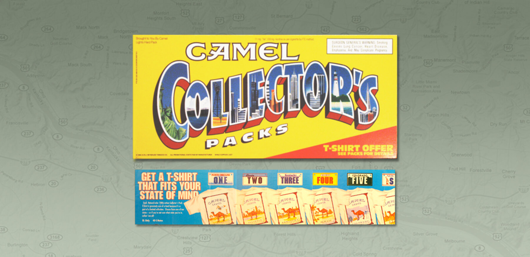
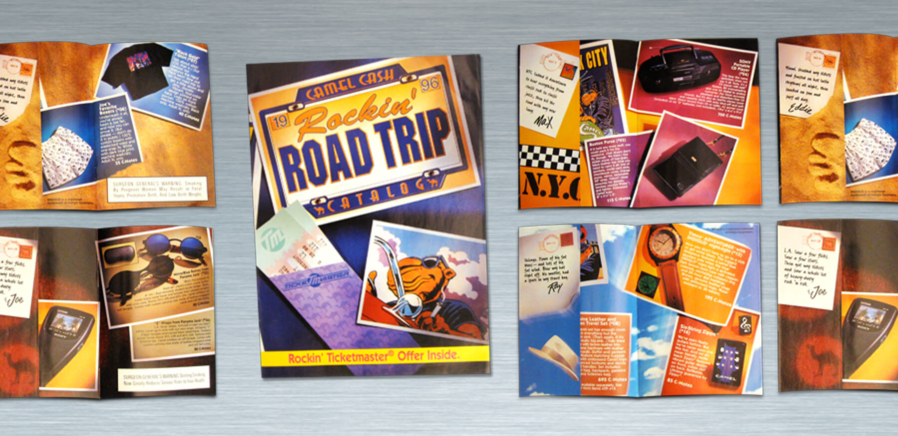
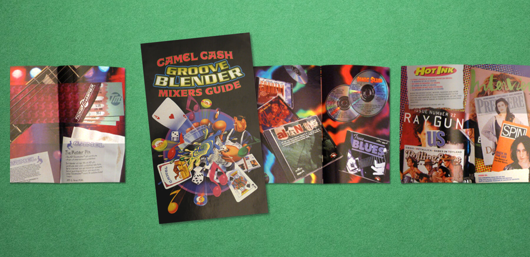
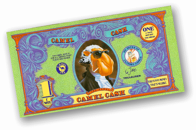
In my time on the promotional side, I worked on countless in-store campaigns. The job entailed taking the quarterly theme concepting designs promotional tchochkis. It also extended to working with the illustrator on new artwork and developing in-store signage. Some of the items I worked on included:
- A 6-foot Joe Camel standee dressed like George Washington
- The car design for the "Smokin' Joe" NASCAR
- Beach-themed flip flops
- Untold numbers of ashtrays & lighters
- Custom Zippos
- Director's chairs
- T-shirts, t-shirts and more t-shirts
- Mugs
- Playing cards (with custom face cards)
- Neon signs
- Wall clocks
- Wall thermometers
- You get the idea...
Towards the end of my stint at the agency, Camel began to create a digital presence as well. We created a monthly e-newsletter and built several Flash pieces to go along with it. This was just after Joe Camel rode off into the sunset.
Moving On...
Being a little older and wiser (and a parent), it’s harder to defend the message. However, I stand by the creativity and unique perspective of the finished pieces. It was kind of cool to play a small role in an interesting part of American pop culture.
Go Back
