EQ, IQ & Vulcans (June 8, 2020)
A Different Way of Looking at the Emotional Quotient


For years there has been a discussion in marketing about appealing to not just the IQ (Intellectual Quotient) of a customer or user, but also the EQ (Emotional Quotient). It's an obvious (but often overlooked) aspect in telling a story that connects the brand to the consumer. These days more than ever it's so important to be able to connect at a more human level.
But people get caught up on words. If you are trying to sell soap or get people to sign up for a newsletter, how do you explain to a client about adding the "emotional quotient"? There are lots of articles about it, but they're often kind of conceptual and don't focus on practical examples.
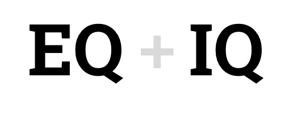
In my previous job I wanted to come up with an easy way to talk about EQ and IQ to a very broad audience. Not just what they mean, but also how to infuse them into the work we do. One that was easy to understand, fun and relatable. Here's my journey to that explanation.
Approaching This Logically
Most of the time you see EQ represented by a heart icon. For IQ you'll see a brain (or gears, or some combo). This is a great starting point. Everyone can relate to the difference between thinking with your heart and thinking with your mind.

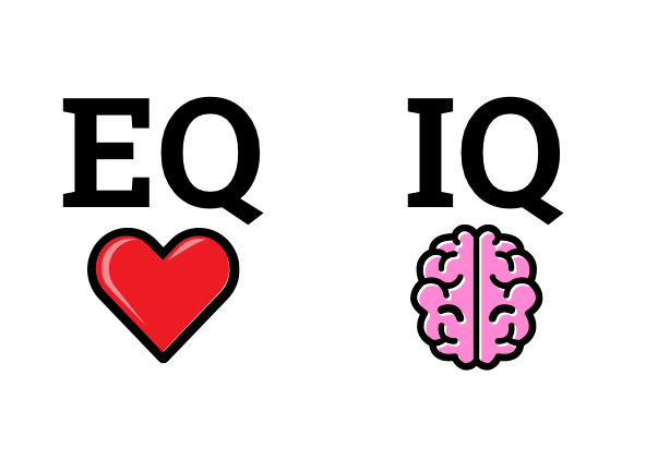
If we characterized each one and turned them into phrases, we might say:

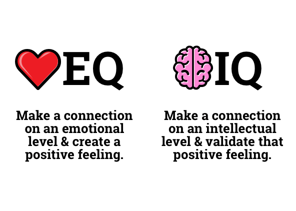


They work together, like tag team wrestling partners. But let's distill that a bit further and look for adjectives that help define each of those sentiments. We may end up here:

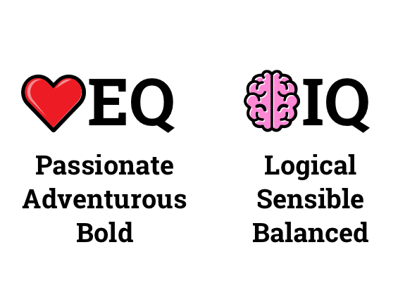


That gives us a little more to work with. People can start associating these kinds of words to convey a sense of what the product is, what it does or how it makes you feel. Different products and services might have different words used, but you get the idea.
Now let's take that one step further and personify them. How can we bring them to life and give people a lens to look through?
Hmmm... what duo accurately represents that list...

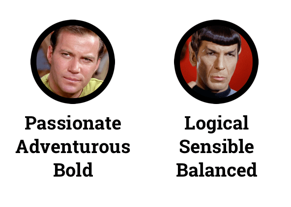


Of course! You can't get much more heart and mind than Captain Kirk and Mr. Spock from the Star Trek Series. And just like the famous sci-fi duo, EQ and IQ work best when they work together.
We can look at our messaging and say "this part right here needs more Kirk". And other times we might think "this is a great place for some Spock". And throughout the experience, we look for ways to balance our Kirk and Spock moments. Just like they did on the TV show.




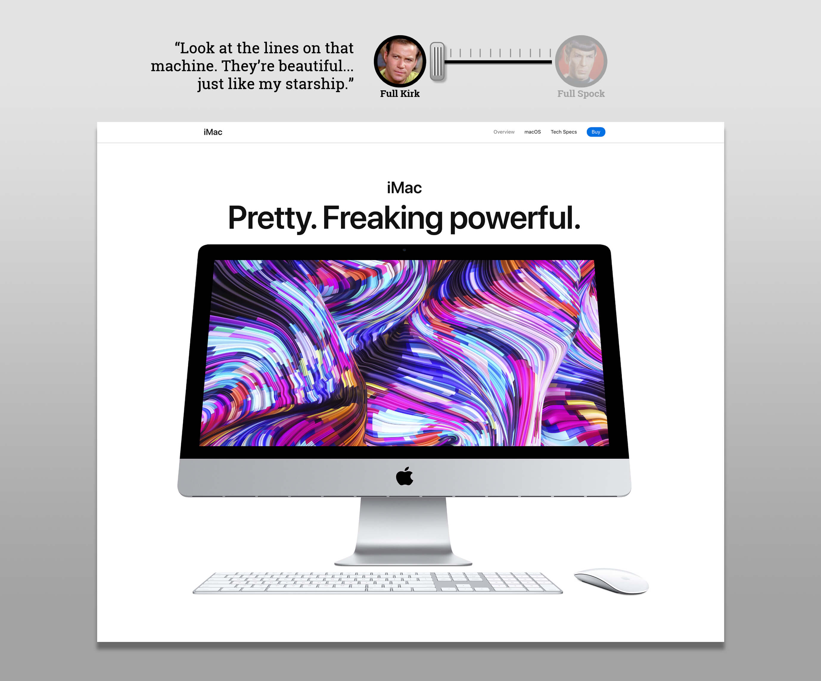
So I introduce to you the Human/Vulcan Modulation Index. As you are building an experience (a website, ad, brochure, form, whatever) think about which direction the slider should move based on the content you have and how you want to influence your customer or user.
The Many Flavors of Kirk & Spock
The words you'll associate with Kirk or Spock will vary depending on the brand voice and message you want to send. Let's look at some examples of how this might look for different companies. I've chosen examples from packaged goods to electronics to services. Each one will have a distinct voice and vibe, so each version of Kirk & Spock will be adjusted to match that.
Apple

Apple is the technology giant that feels luxurious and top-shelf. They are always looking to define when cool is at the moment, but also want you to understand that there is top-notch quality under the hood as well.
The Red Cross

The Red Cross provide compassionate care during disasters and other times of need. This streak of compassion extends to every aspect of their brand. A visit to their site will also help you understand the amazing breadth of their service.
Ivory Soap

Ivory Soap has been around forever, and they want you to know it. They don't shy away from telling you their age and see it as a badge of enduring quality. But they also want to be seen as contemporary.
Northwell Health

I chose Northwell Health because they are local to me, but most hospital systems project a similar message. First and foremost, they are committed to helping people. Your good health is their top priority. And they do it through state-of-the-art facilities and the most modern treatments available.
Chevrolet

Chevrolet is looking to tell multiple messages, depending on whom they are talking to. They want you to know they have strong, powerful trucks. They have innovative hybrid and electric vehicles. And everything they manufacture is dependable and safe.
All right, a lot of words there. How about some pictures to back them up? Let's use Apple to see an example of how they channel Kirk & Spock on their website...
Go Where No Mac Has Gone Before
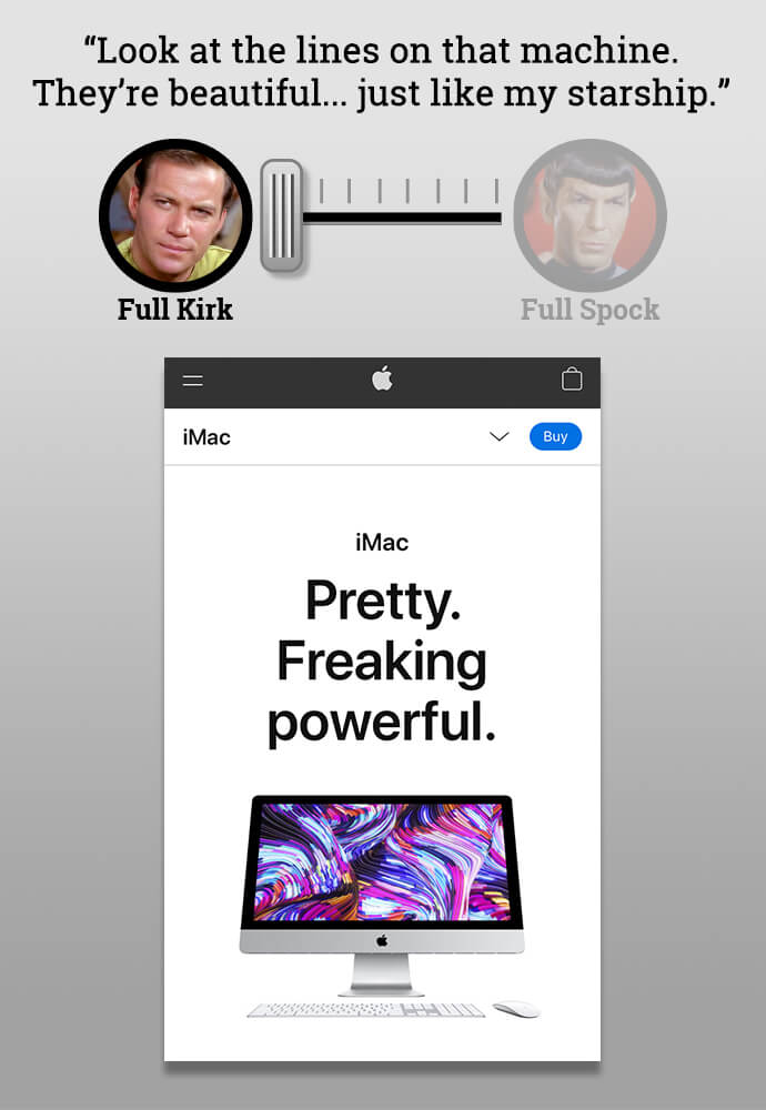
Here's the landing page for the iMac. Gorgeous photography, spartan copy, cheeky headline. They take a bold approach to not just displaying, but also talking about their product.
It's slick, contemporary and alluring... more like fashion than technology. There's a lot of Kirk in this section.
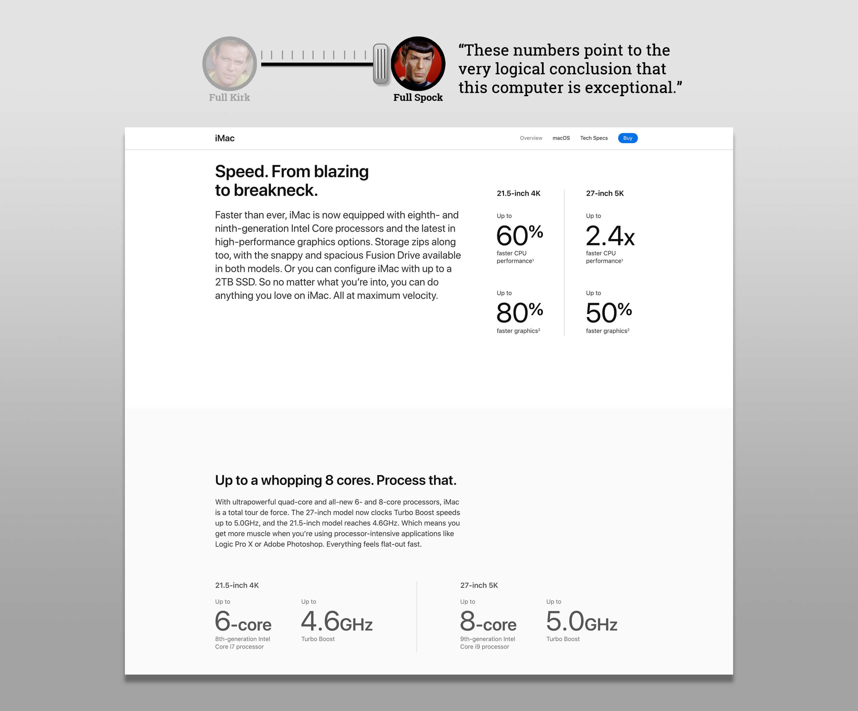
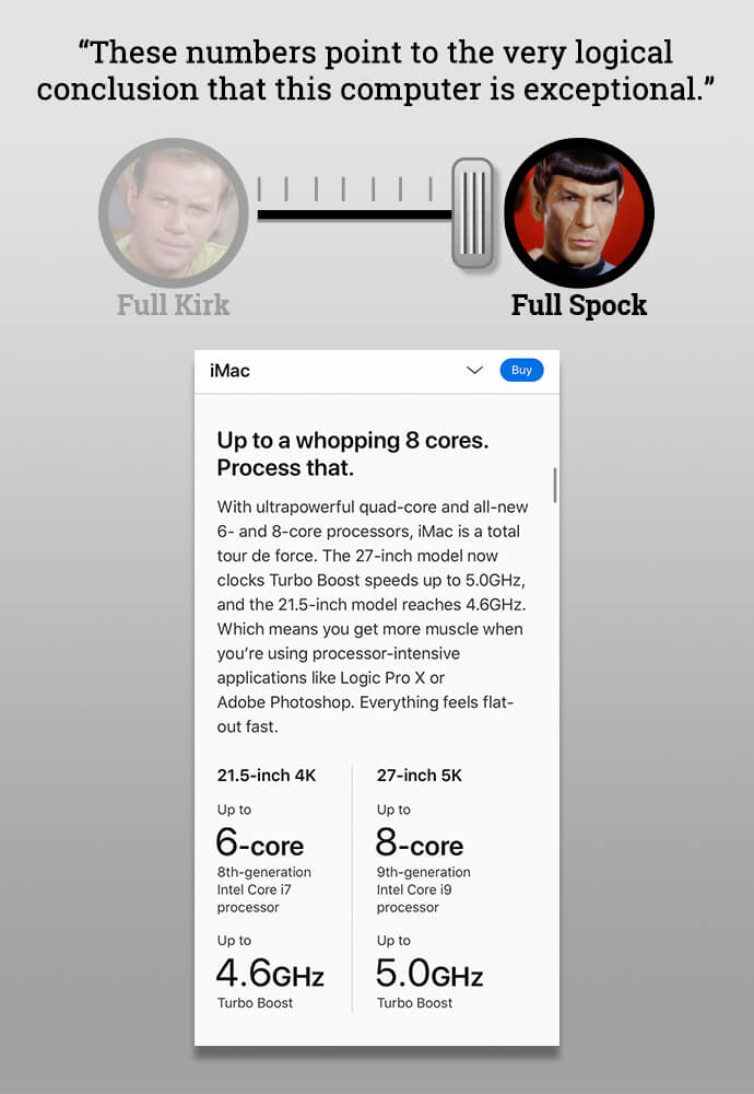
As we scroll down we find the specs for the computer. There are lots of stats here that Spock is gonna need to absorb. This section moves the dial back to the right.
Towards the bottom is an interesting part. It looks like it's all Kirk with a super slick cropping of the iMac -- dial full speed to the left. Then, beneath it is a big chunk of copy with a aptly-labeled link beneath it. Spock's ears perk up here. Only seems logical to have this information here.
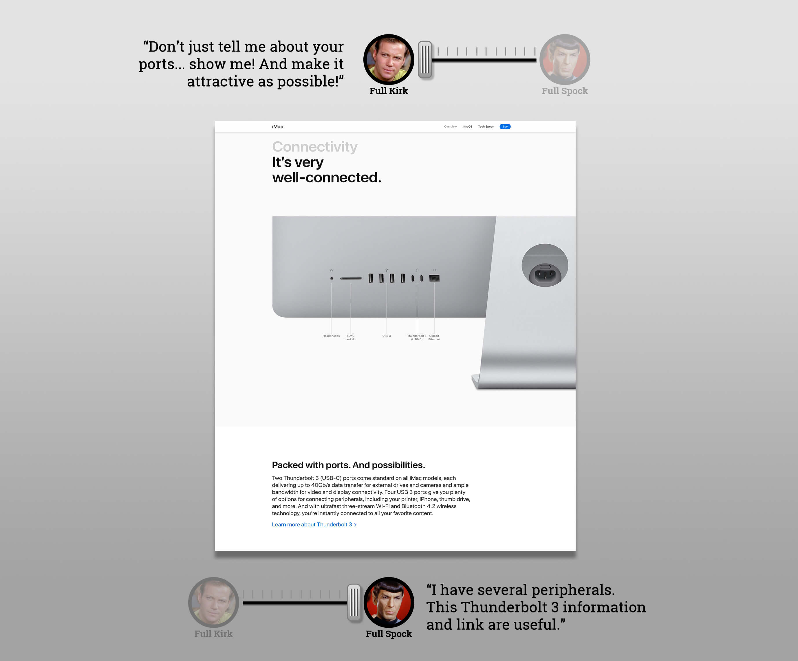
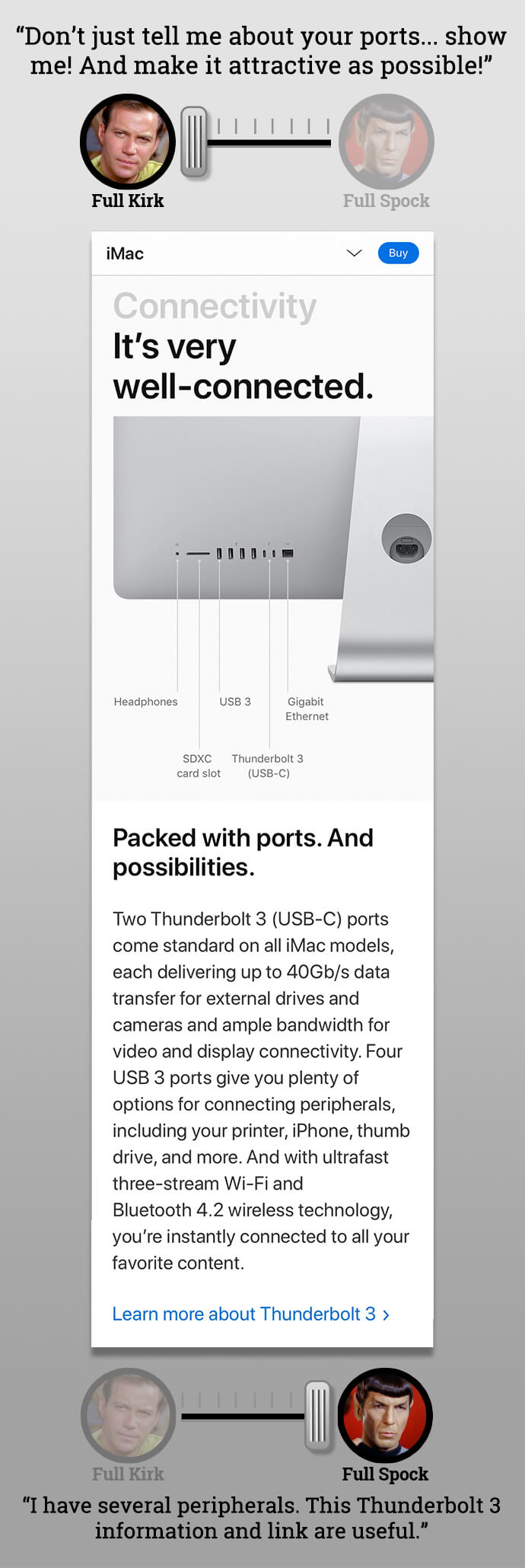
But each area is kind of partitioned off. So the beauty shot has its place to shine and the copy is just outside of it inside it's own content bubble.
This is the perfect example of how Apple has balanced the right amounts of Kirk and Spock for their brand. They've created an experience that has a bold, luxurious feel to it that can make your heart skip a beat if you're in the market for a new machine. But it also includes a rational, analytical argument for buying it that will satisfy any technical concerns.
Just to Wrap This Up...
So, is this explanation the definitive dissertation on EQ and IQ? Nah, it's just my two shiny pennies.
Consider it just another way of thinking about balancing how your communications and messaging are delivered. Recognize that when it comes to EQ and IQ, it's not one or the other. It's a thoughtful, choreographed mix that can help send the right message with the right tone at the right time.
Live long and prosper.