PD One App (2013)
iOS App, Art Direction, Design
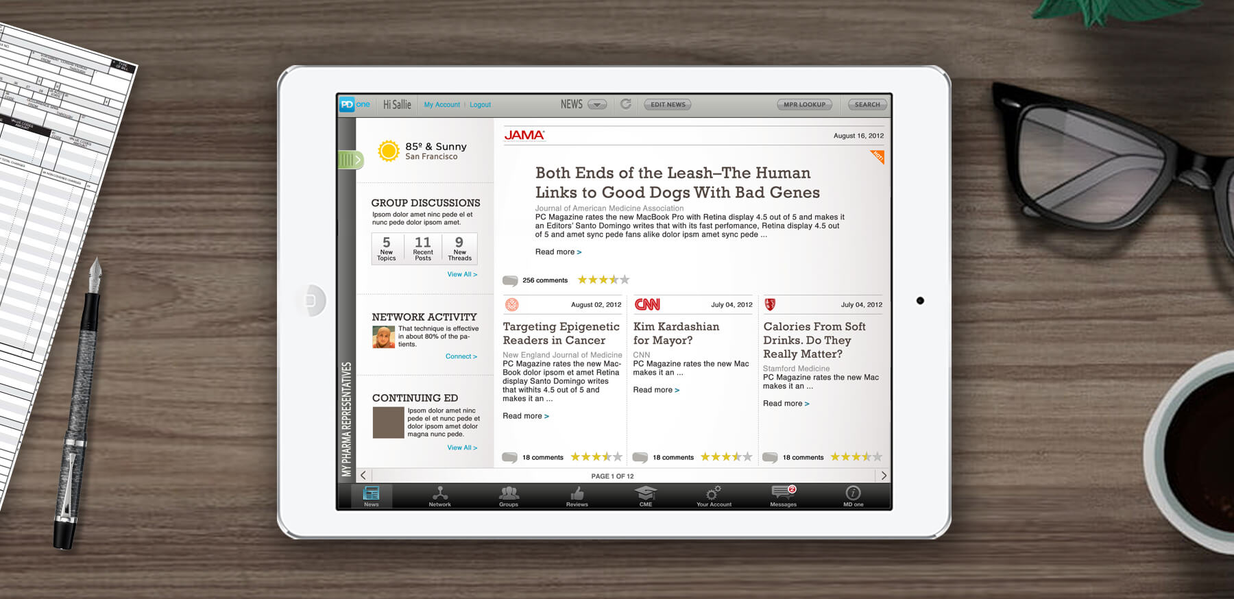
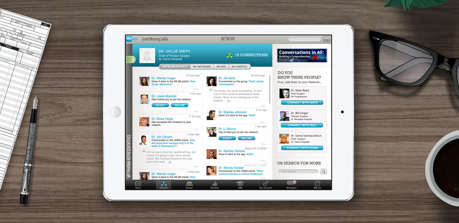
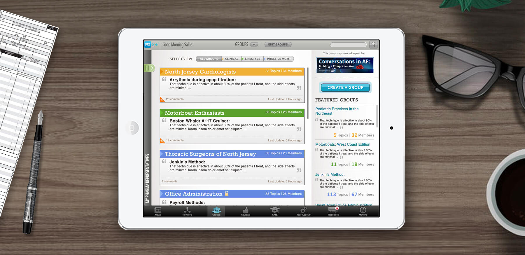
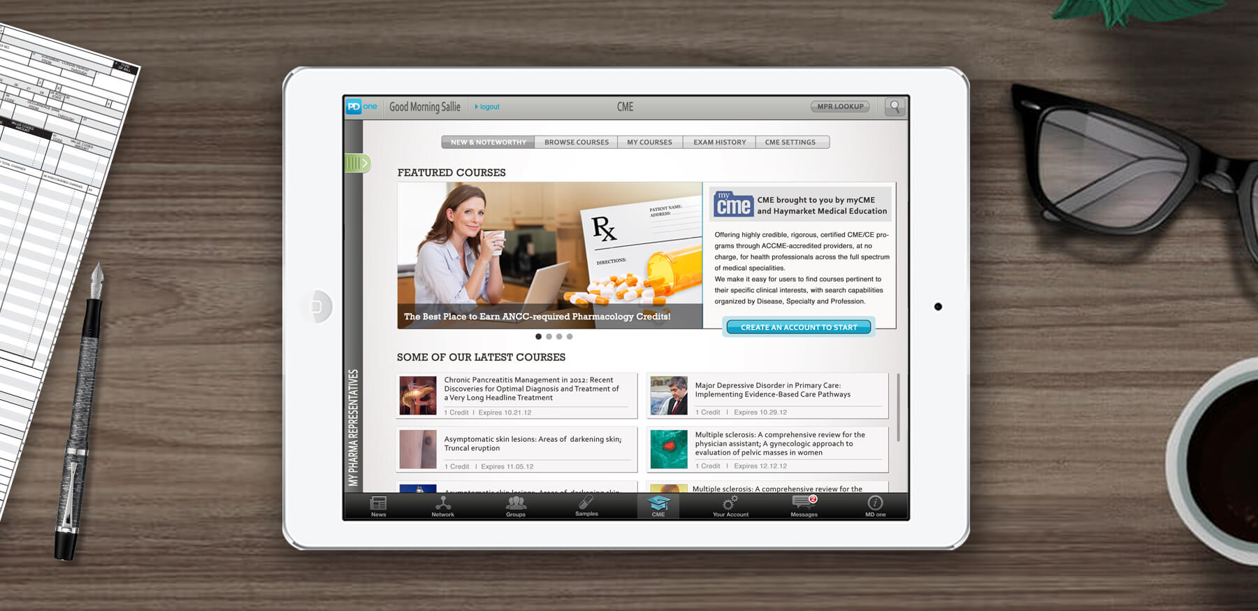
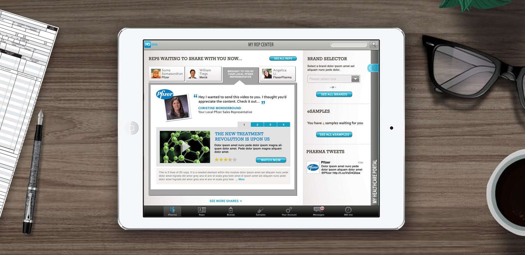
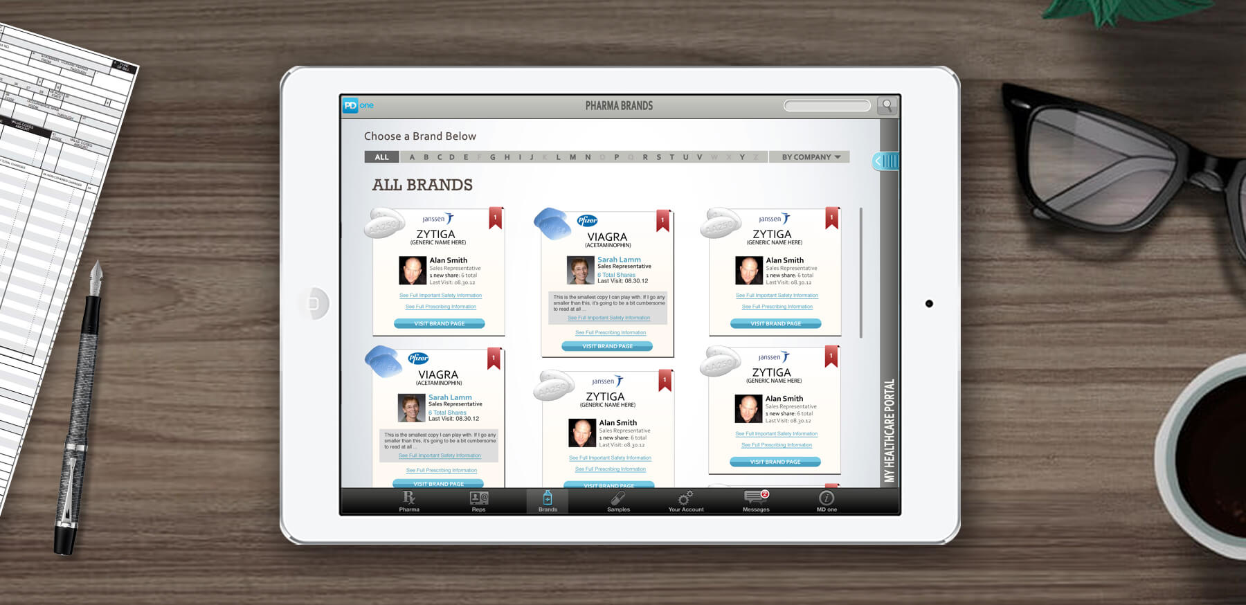
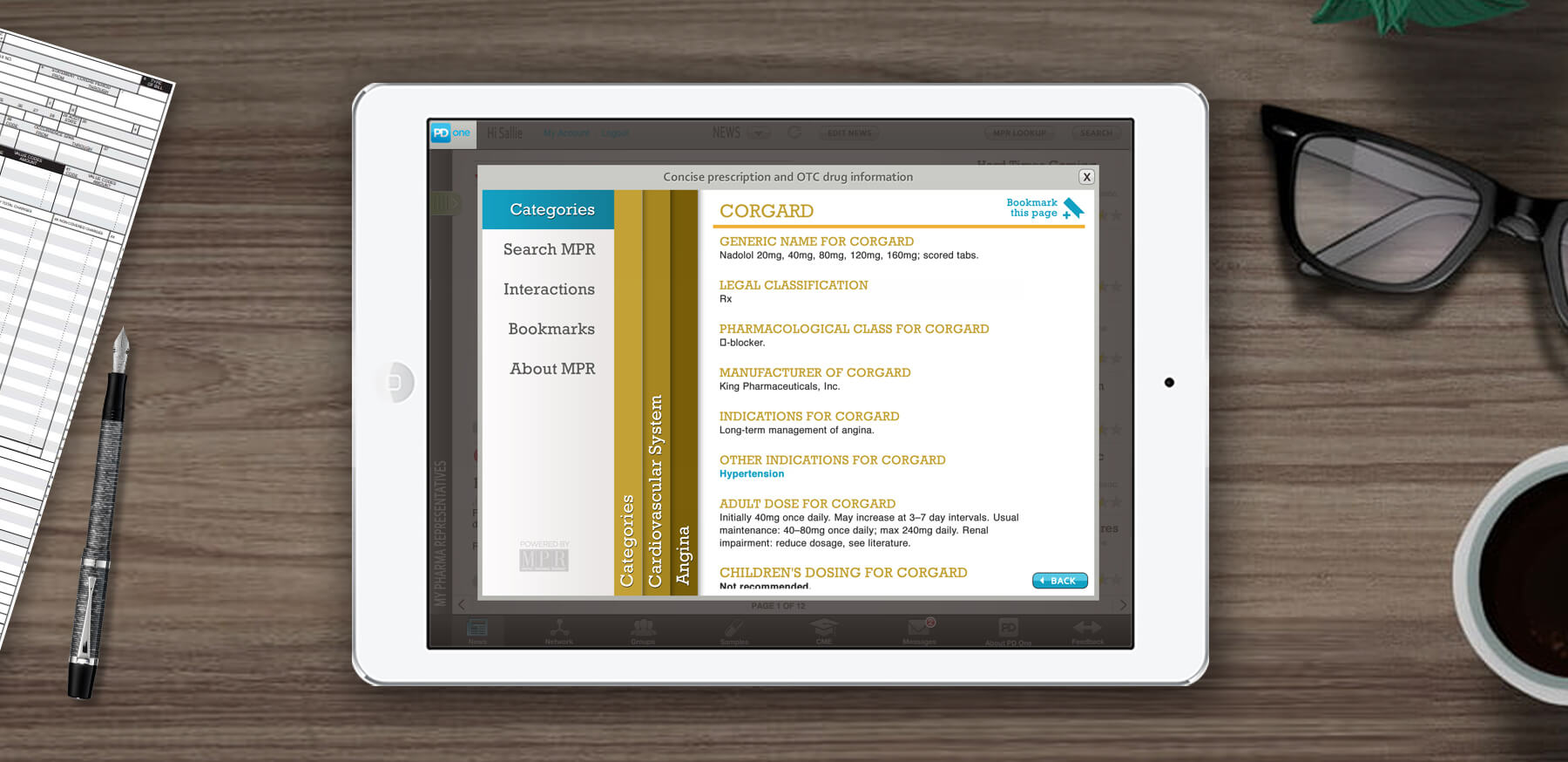
The PD One app was envisioned as a pharma rep tool that would help increase engagement with doctors. But it also served as a social networking platform for doctors. It took the form of an iPad app, and eventually a website.
The Road to Launch Day
It was a 8 month project where I served as the design & UX lead. The first phase was requirements gathering, working closely with tech to establish a definitive list of features we wanted to support at launch. That lead to the development of the app's IA, wireframes for all of the screens and functional models for select interfaces to ensure the usability was right.
I lead a small team of designers to create the brand identity, build comps for all screens and document specifications for the development team. It's amazing how many extra pages pop up as you start to test the experiences and then realize steps are missing. No problem, we were ready for that and built out all the necessary additions and were prepared to send it out into the world.
Launch!
The app was submitted and got approval from the Apple App Store! So mission accomplished. right?
Well, not really. Some of the stakeholders got cold feet and decided to pull the app back in favor of launching as a website first. So the work was repurposed to fit a responsive experience online.
Relaunch?
I've been out of the company a couple years now, and I hear the program is currently on shaky ground. They've had trouble securing commitments from drug companies and have had a difficult time getting traction with doctors. The goals from the outset were bold, and I thought we did a good job setting up an initial version of the site.
Unfortunately, if you don't have a little bit of luck or a couple well placed breaks it's hard to get a startup off the ground. Sure had fun and learned a lot trying.
Go Back
