TV Sucks. Let's Fix It! Part I (August 10, 2020)
How our providers serve up programming hasn't really changed in years. It should.

This is a 3 part series on re-thinking television
Specifically, how cable & satellite companies deliver content to us and how we navigate through it.
Part 1 examines the inherent problems that exist. Part 2 looks at how to change them. And in Part 3, I'll show what some of those changes could look like.
I love TV. I have ever since I was a kid. And I thought that by 2020, I would have a hovercraft and the TV experience would be the stuff of science fiction. I was wrong in both cases. What happened?
Cable has lost its way
I’m doubtful cable TV will last another generation. More people are dropping it for streaming services and it feels inevitable that it will disappear.
But I propose this series of posts 1) as a blueprint for understanding what the problems are and 2) to provide a road map to getting cable back on track. I know its demise may be a fait accompli, but I thought this might make an interesting design exercise... so humor me 😊
In the beginning...
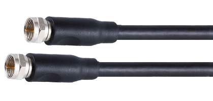
TV started with only a handful of stations. So for choosing a channel, a simple dial sufficed. Once cable started to take off, the number of channels jumped to 50ish. So a bigger dial still worked. It was a bit of a challenge to remember all the stations, but it was doable.
Flash forward to today and there are hundreds of stations. The interfaces our cable & satellite providers give us seem woefully out of step with the challenge and clunky compared to the slick UIs of the cord cutting newcomers like Netflix and Hulu.

Problem #1:
Numbering stations makes no sense anymore
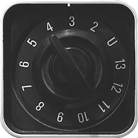
As previously mentioned, when there were a dozen stations they mapped cleanly to a dial. Channel 4 was literally Channel 4. Now with hundreds of stations today there is no logical connection between NatGeo being on channel 162 or ESPN2 being on 211 (and also on channel 35, WTF!). It's an arbitrary assignment that isn't consistent across all providers.

Problem #2:
The remote has lost control
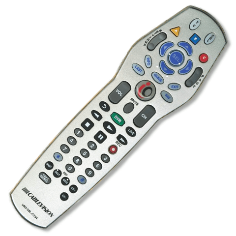
My cable remote has 46 buttons on it. A Roku controller has 18 buttons (4 of which are just big advertisements for streaming services). With less than half the buttons of the cable remote, a Roku controller effortlessly moves me around content. In this case, less is more.
Problem #3:
1997 wants its cable box back
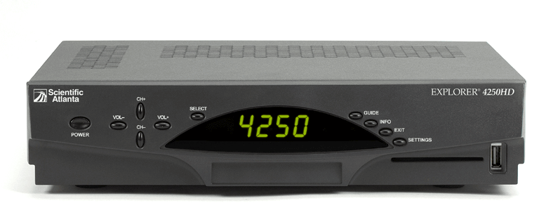
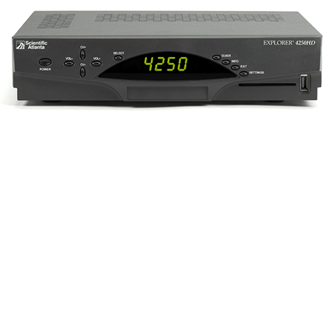
Pound for pound, the cable box is probably the most useless thing in my house. It's way too big for what it does compared to a Firestick or AppleTV. It also reminds me of a VCR in form factor. Which is probably not the best piece of electronics to be compared to these days.
Problem #4:
The need for an interface-lift
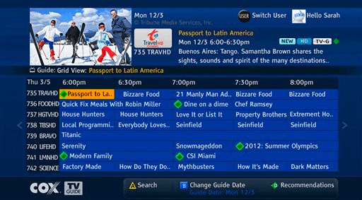
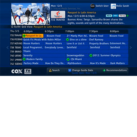
The interface is dated. It's also slooooooow. Sometimes there is a multi-second delay between hitting a button and when the guide responds. It's the definition of cluttered. There's no hierarchy. There's no meaningful filtering. <sarcasm> Other than that, I love it </sarcasm>
Problem #5:
An overall lack of design
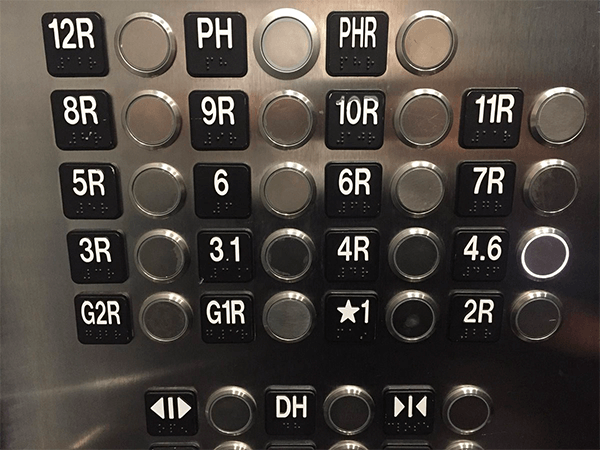
In a nutshell, the whole experience lacks visual good taste. Our phones and gaming devices have set expectations that everything should have a high-level of design detail. And from a CX perspective, even the simple action of ordering tacos online is a first-class user experience. In contrast, the entire process of interacting with the TV can be messy, banal, confounding and bothersome all at the same time.
Next Time:
So just to sum it up: the arbitrary order of channels is kind of weird, the remote is dreadful, the box is feeling outdated, the UI leaves us confused and the vibe of the whole experience doesn't feel very contemporary. There's probably more to pick on, but let's use this as a baseline.
Next time I'll present an outline of new ways to look at how TV can be better delivered to us. We'll look at new solutions to address these problems and be on the road to a better experience.
As they say, “stay tuned”...