Viz.ai(2021+)
All Things Digital & Analog
Viz.ai is a SaaS company that uses AI to examine CT scans and MRIs to quickly identify disease states such as stroke, aneurysm and pulmonary embolism in patients.
It then communicates with the hospital care team to direct that patient care they need as quickly as possible. This new process takes just minutes compared to the old method that can take an hour or more. It's especially useful in rural hospitals without the resources to have neurologists and radiologists in-house 24/7.
As the Creative Manager in Marketing, I lead an exceptionally small (and exceptionally talented) team of creatives to help develop materials to help clients, prospective clients and the healthcare community understand who we are and what we do.
Here are some of the ways I've contributed at Viz...
1 / Brand Development
When I first began at Viz, there was the makings of a brand story in place. We had a logo and palette that had been in use for a year or so.
Since we were a small company with a small marketing budget, a refresh of the existing brand felt like the most logical step forward. Lean into the existing equity, but evolve the conventions to create a new take. This wasn't going to be a red velvet curtain reveal, it was going to take place over time.
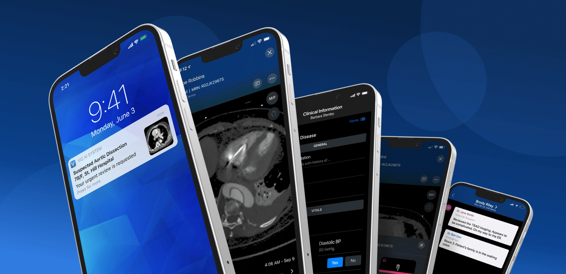
Phone as Hero
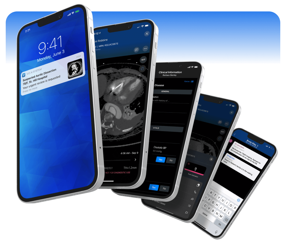
Since our product was used on a mobile phone, most of our marketing focused on the app as hero. So I created a set of ultra photo-realistic 3D mockups for the phones for a more dynamic presentation using Rotato. This insured the product was the star of the piece and gave it a style and flair.
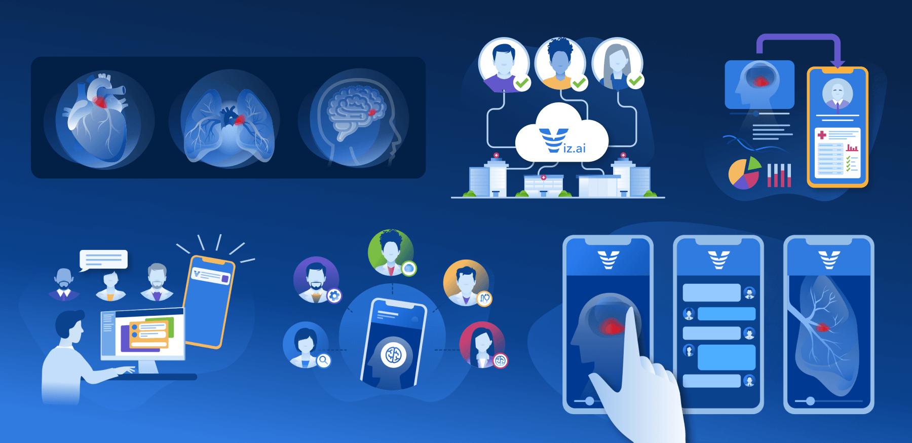
More Complex Iconography
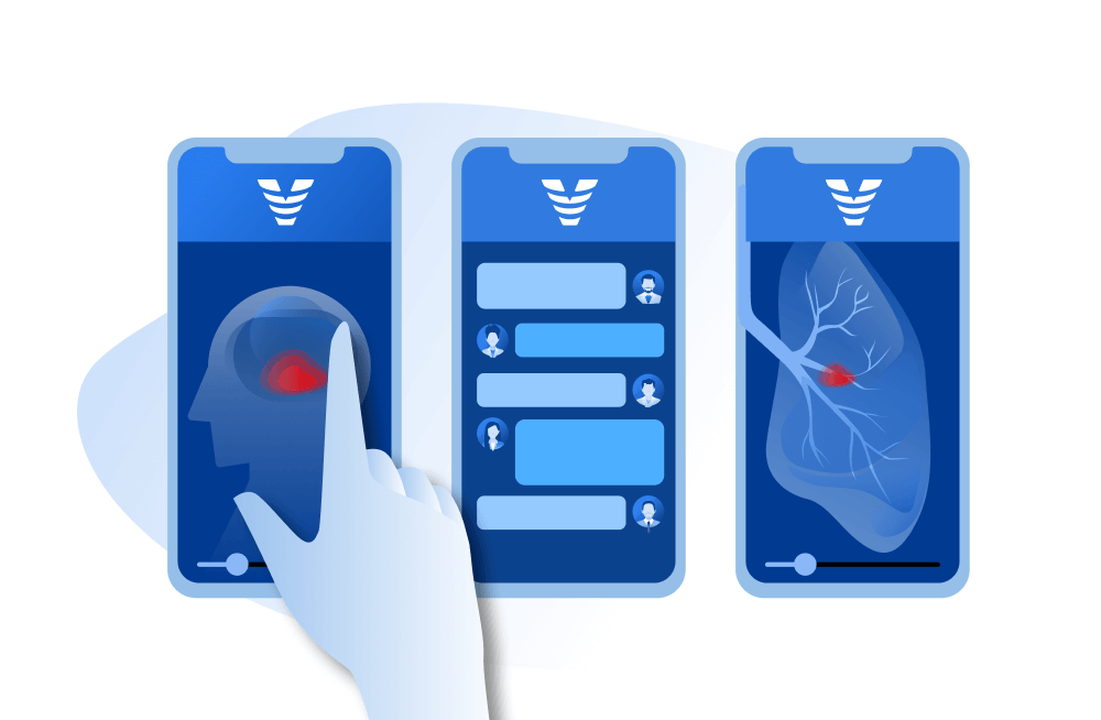
Next up was the iconography. The simple line style was clean and delightful, but lacked gravitas when they were presented at larger sizes. In partnership with another designer on the team, we developed a new illustration style that was more robust and brought in additional colors to warm up the palette. It was also simple enough for us to take stock icons and convert them easily into our visual voice.
2 / Motion Graphics & Video Editing
I had done some video prior to joining Viz, but here I stepped up my game and became more adept...
Motion Graphics for Simple Animations
I only have a few years of AE experience under my belt, but I do know the program well enough to create some fairly engaging animations. I use AE for shorter, simpler pieces -- conference booth video loops, product demos, digital ads.
I always storyboard my pieces prior to going into production. I find that time spent developing the concept in keyframes helps everyone understand how the story will be told, makes adjustments as needed and get everyone to buy in. Once it goes into production, it comes to life and you can draw a line of sight between the final piece and the storyboard... every step builds on the previous step.
Video Editing for Complex Storytelling
Longer form video (talking head, interviews, webinars) is best handled in Premiere instead of After Effects. While AE has some wonderful tools for animating, it is not well suited for more linear storytelling. This is an important lesson I've learned in my video journey.
While at Viz I've edited many long-form videos in Premiere and developed a good sense of when to use it instead of or in conjunction with AE. This maturity with the two programs has allowed me to work more quickly and with better results.
3 / Brochures
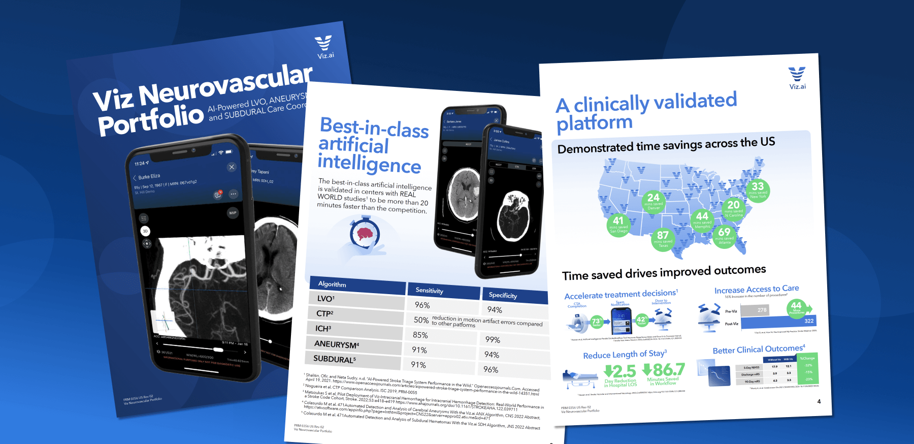
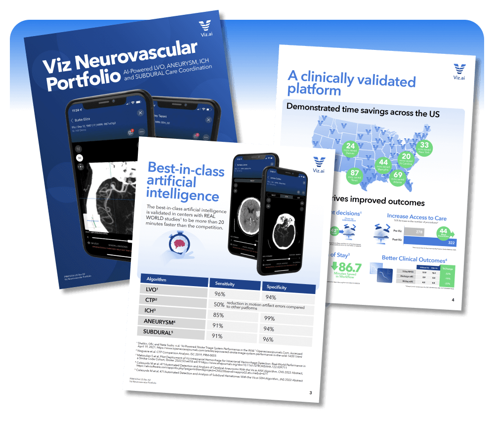
Conferences and face-to-face meetings are a staple of the Viz go-to-market strategy. So brochures (both printed and digital) are still a big part of how the product is marketed. I'm particularly proud of how much I've been able to push the design of our brochures since I've started at Viz.
When I begin a brochure with a Product Manager, I like to walk through all of the content with them and understand what story it is they would like to tell. Then I thumbnail each page of the experience.
For me each page needs a hero -- some focal point that provides visual interest, but also defines the purpose of the page. I also look for ways to find a balance between content heavy pages (where explanation is needed) and more billboard-like pages (where the eyes can rest). And finally I am always looking to connect the story between pages so there is some continuity as the viewer moves through.
4 / Presentation Design
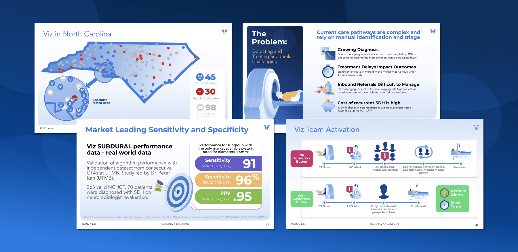
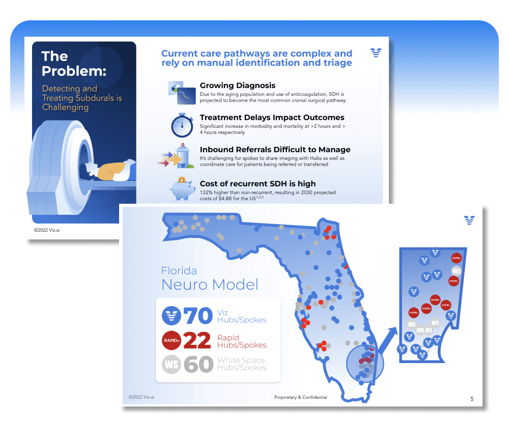
While not the sexiest design jobs out there, presentation design is a critical (and often overlooked) component of successful marketing communication. Why? Lemme tell you...
I spent many years in management consulting putting together presentations for the C-Suites of Fortune 50 companies. Anytime you have the eyes & ears of stakeholders it's an opportunity to make a good impression and set a bar for how you are perceived. If you present poorly designed slides that don't quickly get your point across, you lose interest in the room and damage the company brand.
I take great pride in elevating the presentation experience, leaning into the brand and making it as engaging as possible. Storytelling is not only possible in presentation design, it is MANDATORY. Just because it's Google Slides doesn't mean it can't be interesting or visually appealing!
It's another visual medium and can be approached with the same enthusiasm and intensity as any other format.
5 / Trade Show Displays
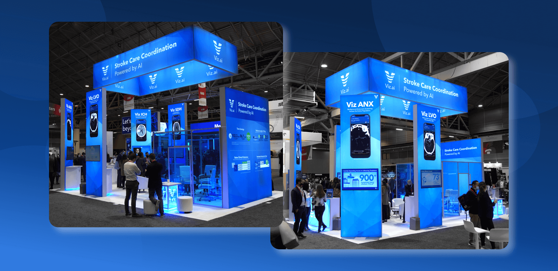
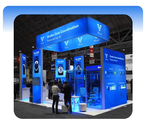
Up until this point in my career I had done a couple trade show booth displays. Nothing complicated, just a simple panel or oversized easel card. But trade shows and conferences were a huge part of the Viz sales process, so I suddenly became immersed in the intricacies of making a big splash in a big space.
Many years ago I did a lot of out-of-home advertising -- billboards, bus/subway posters -- so I did have some experience with large scale communication. However, conference booths are a slightly different animal. You have more unorthodox spaces to work in and several pieces in proximity to each other that need to be complementary.
I always look to create a big impression with a hero image -- it's almost always a screen from our app. The angle of the phone should be dramatic and the headline should be prominent. We always include other content, but I make sure the image/headline is the star of the show.
We often have "towers" that go along with main wall. These serve as excellent promotional vehicles for our product lines.
We are also known in our space as the "blue" company. The cool, iridescent blue backlighting and LEDs provide a memorable and ownable brand experience that is consistent with all the other work we produce.
Everything is tied up together with a nice, neat (blue) bow.
Go Back
